
In a blog post from March 30, Wolfers pointed out something very interesting. He asked the question, why did John Taylor use 1990 as his start point? In fact, if he went back to say 1970, what would the chart look like? Well, Wofers made just that chart.
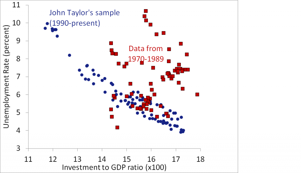
Well whoops. Apparently investment and unemployment are not all too well correlated. Wolfers tries to explain this by saying:
On balance, times in which the investment share is higher, are slightly more likely to be good times. But I’m not sure why. Is it—as Taylor asserts—that high investment shares create good times? Or is it that good times encourage investment? Or is it a third factor—perhaps in good times the government doesn’t need to prime the fiscal pump, and so the investment share is higher? Or is it something else?
I am not sure that I entirely agree with his conclusion. To me, the fact that there is such a strong correlation since 1990 cannot just be disregarded as a fluke. And why the entirely different pattern between 1970 and 1990? Wolfers says that the sample size is too small, but is 20 years really too small of a sample size? Instead, I think that this graph indicates a change in the economy between those two time periods.
But still, here I sit wondering what that change could be. Stagflation has entered into my mind, and a breakdown showing the points during the 1980s separate from the 1970s would be nice. Still though, it is not as if any of this really matters, because these economic data are subject to so many variables that trying to isolate any one thing as the cause through correlation studies is impossible. Theoretically, we know that with higher investment would come less unemployment. However, if the government is furnishing that investment, they will not be as effective at investing in the short term (corruption, fat union contracts), and in the long term that investment will not even pay off leading to a sluggish economy comparatively (money was spent on a wasteful investment instead of a better one). So however the debate on this chart ends up does not really matter to me. Theoretically we already know the answer; empiricism is just the refuge of the illiterate economist.

Something doesn't add up. It would be interesting to take Taylor's data and add one year of data at a time and see exactly when the correlation broke down. Then investigate if there was a difference in the way either unemployment was calculated or in the way the GDP was calculated. Something had to have changed. If not you have a real mystery on your hands.
ReplyDeleteBTW, thanks for the info the other day and congratulations on your graduation!